Structured list
Structured lists group content that is similar or related, such as terms and definitions.
Overview
Structured list displays a simple list with a considerable amount of items of read-only values. It helps organize and present grouped information into logical and scannable patterns. The content within a list can be stacked to create hierarchy within the data.
When to use
- To browse information or select certain information within the group in the simplest form
- To view description and detailed information, present features, or compare pricing plans
When not to use
Nesting items is not recommended, as structured lists are used to present simple data. If you have more than 25 items or additional content that needs to be shown, consider using a data table, which supports nesting items and presents a larger set of content.
Variants
| Variant | Purpose |
|---|---|
| Default | Allows the user to quickly browse and view information within a group of data |
| Selectable | Allows the user to mark or select a desired option within a group of data |
Live demo
<StructuredListWrapper ariaLabel="Structured list"><StructuredListHead><StructuredListRowheadtabIndex={0}><StructuredListCell head>ColumnA</StructuredListCell><StructuredListCell head>ColumnB</StructuredListCell><StructuredListCell head>ColumnC</StructuredListCell></StructuredListRow></StructuredListHead><StructuredListBody><StructuredListRow tabIndex={0}><StructuredListCell>Row 1</StructuredListCell><StructuredListCell>Row 1</StructuredListCell><StructuredListCell>Lorem ipsum dolor sit amet, consectetur adipiscing elit. Nunc dui magna, finibus id tortor sed, aliquet bibendum augue. Aenean posuere sem vel euismod dignissim. Nulla ut cursus dolor. Pellentesque vulputate nisl a porttitor interdum.</StructuredListCell></StructuredListRow><StructuredListRow tabIndex={0}><StructuredListCell>Row 2</StructuredListCell><StructuredListCell>Row 2</StructuredListCell><StructuredListCell>Lorem ipsum dolor sit amet, consectetur adipiscing elit. Nunc dui magna, finibus id tortor sed, aliquet bibendum augue. Aenean posuere sem vel euismod dignissim. Nulla ut cursus dolor. Pellentesque vulputate nisl a porttitor interdum.</StructuredListCell></StructuredListRow></StructuredListBody></StructuredListWrapper>
Formatting
Anatomy
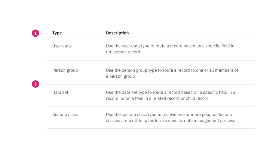
Structured list is composed of two sections—column header and data row.

- Column header: Shows titles for the row header description.
- Data row: Shows different types of data. Rows can be selectable and modified to show alternating zebra stripe background colors
Sizing
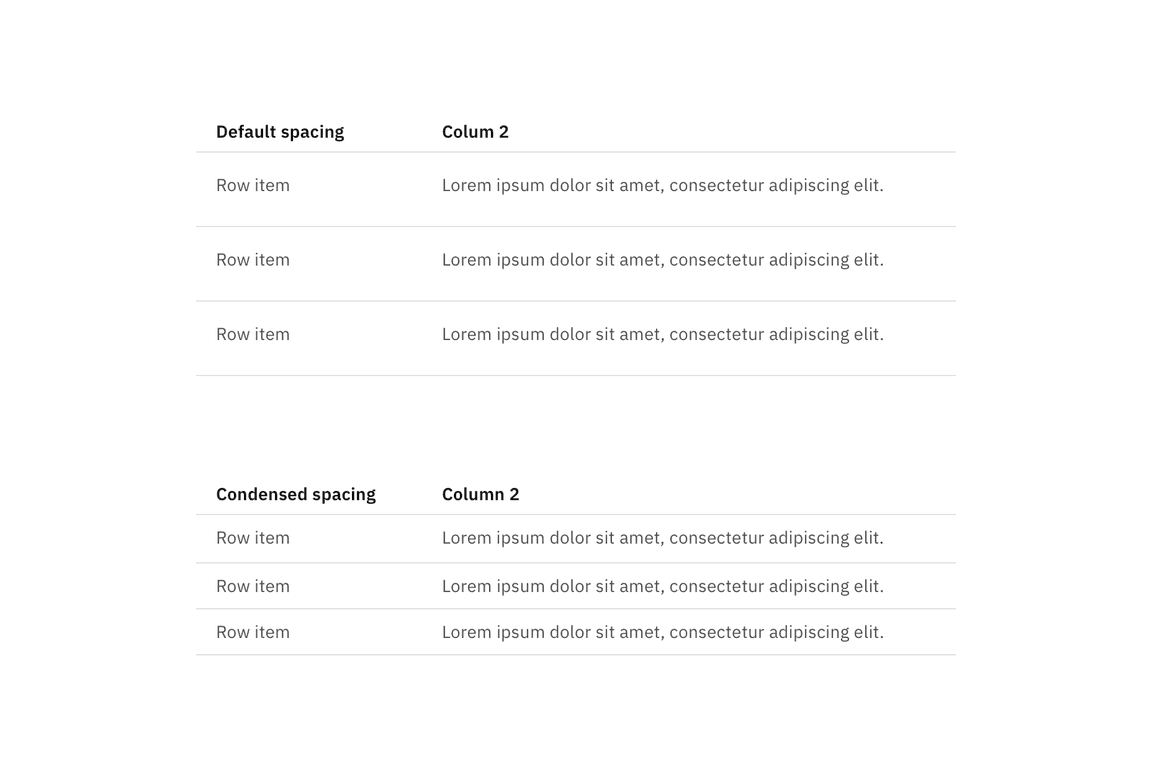
The structured list is available in two different sizes in height: default and condensed. The structure list’s width varies based on content and layout.

Alignment
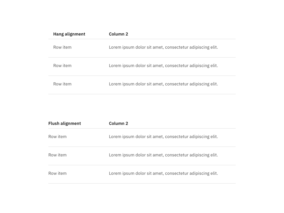
The structured list is available in two alignment styles: hang and flush alignment.

Content
- A maximum of three paragraphs of text is recommended per row.
- A structured list’s title and row information should use sentence-case capitalization.
Column header titles
- Column header titles should be short and clear, sticking to one or two words that describe the data in that column.
- In cases where a column header title is too long, wrap the text to two lines and then truncate the rest of the text. The full text should be shown in a tooltip on hover.
- Column header titles should use sentence-case capitalization.
Interactions
Selectable structured list
- Only one item can be selected from the list.
- By default, one option should be selected.
- If you need to select multiple items, use a data table.
- When the user selects an item from the list, the selected row will appear with
the
checkmark--filledicon.
Related
These following components are additional ways to organize a group of data.
Feedback
Help us improve this component by providing feedback, asking questions, and leaving any other comments on GitHub.